

tags:- Line Chart,Candlestick Chart,Bar Chart,Candlestick Chart
Line Chart
The line chart is the original type of chart. In order to plot it, a line connects single prices for a selected time period. The most popular line chart is the daily chart. Although any point in the day can be plotted, most traders focus on the closing price, which they perceive as the most important. (See Figure 5.4.) But an immediate problem with the daily line chart is the fact that it is impossible to see the price activity for the balance of the day.
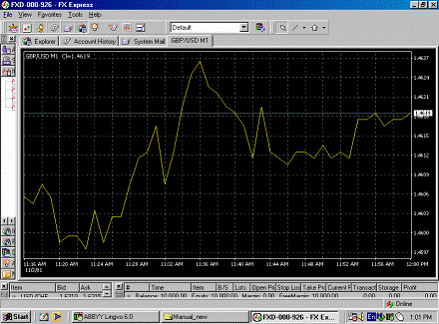 |
| Figure 5.4. An example of the line chart |
Line charts are considered for technical analysis because due to the sophistication of current charting services, daily price activity does not need to be lost.
Daily line charts are useful when looking for the big picture or the major trend because, without line charts, intraday activity would be-come an unimportant detail. When plotted over a long stretch of time, such as several years, a line chart is easier to visualize. Also, technical analysis goes well beyond chart formation; in order to execute certain models and techniques, line charts are better suited than any of the other charts.
However the line chart is a continuous chart, and this is a disadvantage because price gaps cannot be charted on a continuous chart.
Bar Chart
The bar chart is arguably the most popular type of chart currently in use. It consists of four significant points (See figure 5.5.):
• the high and the low prices, which are united by a vertical bar;
• the opening price, which is marked with a little horizontal line to the
left of the bar;
• the closing price, which is marked with a little horizontal line to the
right of the bar.
 |
| Figure 5.5. An example of the bar chart. |
The opening price is not always important for analysis. Bar charts have the obvious advantage of displaying the currency range for the period selected. The most popular period is daily, followed by weekly. Other periods may be selected as well. An advantage of this chart is that, unlike line charts, the bar chart is able to plot price gaps that are formed in the currency futures market. Although the currency futures market trades around the clock, physically it is open for only about a third of the trading day. (Chicago IMM is open for business 7:20 am to 2 pm CDT.) Therefore, price gaps may occur between two days' price ranges. Incidentally, the bar chart is the chart of choice among currency futures traders.
Candlestick Chart
The candlestick chart is closely related to the bar chart. It also consists of four major prices: high, low, open, and close. (See Figure 5.6.) In addition to the common readings, the candlestick chart has a set of particular interpretations. It is also easier to view.
 |
| Figure 5.6. An example of the candlestick chart |
The opening and closing prices form the body (jittai) of the candlestick. To indicate that the opening was lower than the closing, the body of the bar is left blank. In its original form, the body was colored red. Current standard electronic displays allow you to keep it blank or select a color of your choice. If the currency closes below its opening, the body is filled. In its original form, the body was colored black, but the electronic displays allow you to keep it filled or to select a color of your choice.
The intraday (or weekly) direction on a candlestick chart can be traced by means of two "shadows": the upper shadow (uwakage) and the lower shadow (shitakage).
Just as with a bar chart, the candlestick chart is unable to trace every price movement during a day's activity.
Copyright (c)Tooklook.net and FOREX. On-line Manual For Successful Trading


0 comments:
Post a Comment